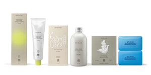
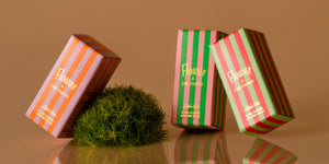
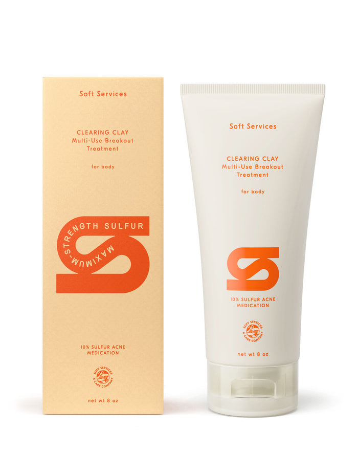
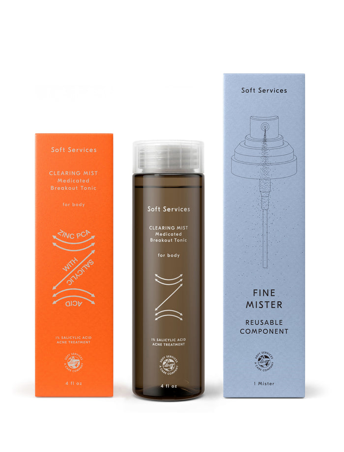
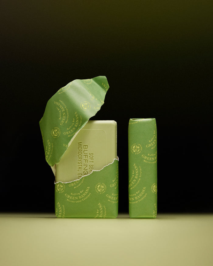
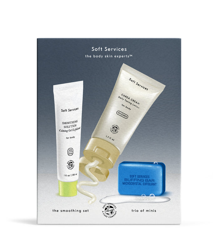
Soft Services creates focused products for body skin’s specific problems. The brand identity was developed around the idea that each of these products deserves its own visual world. The brand identity is built to change, with core brand-level elements but variation and play in the product-level designs.
Your body skin issue can be fixed. Packaging can be sustainable without sacrificing design. Products for problem areas can look good enough to live on the top shelf. Brands don’t have to be consistent.
Everything can be different.
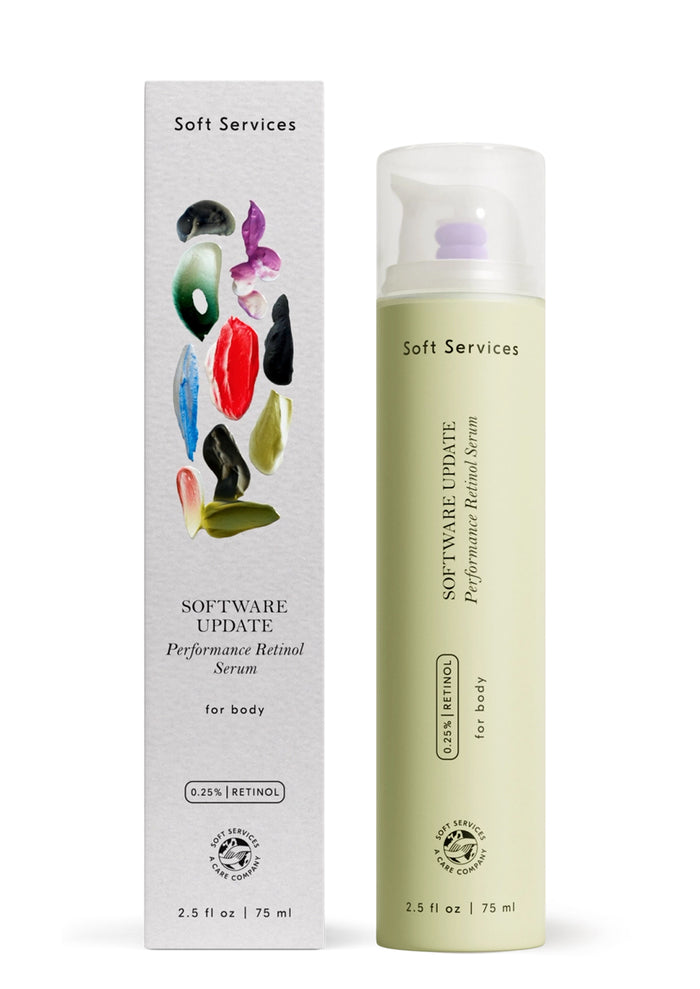
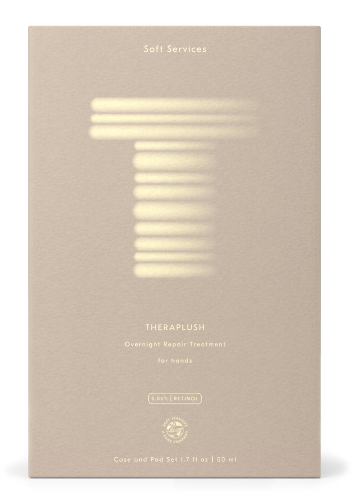
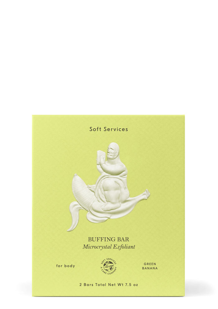
Packaging Production and Industrial Design: Doris Dev
Illustration: Lulu Lin, Pete Gamlen, Kam Tang, Manon Cezaro
Renderings and Photography: Soft Services, Anemone Works, Chelsea Craig
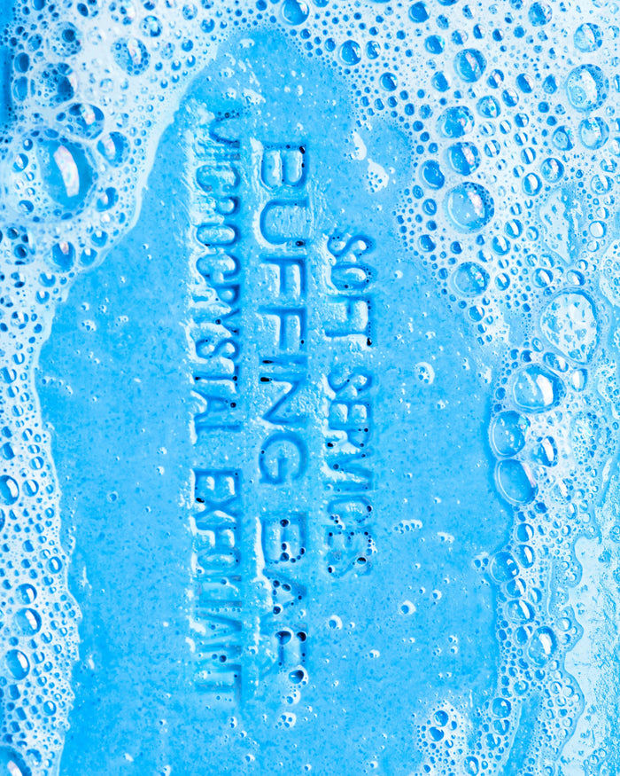
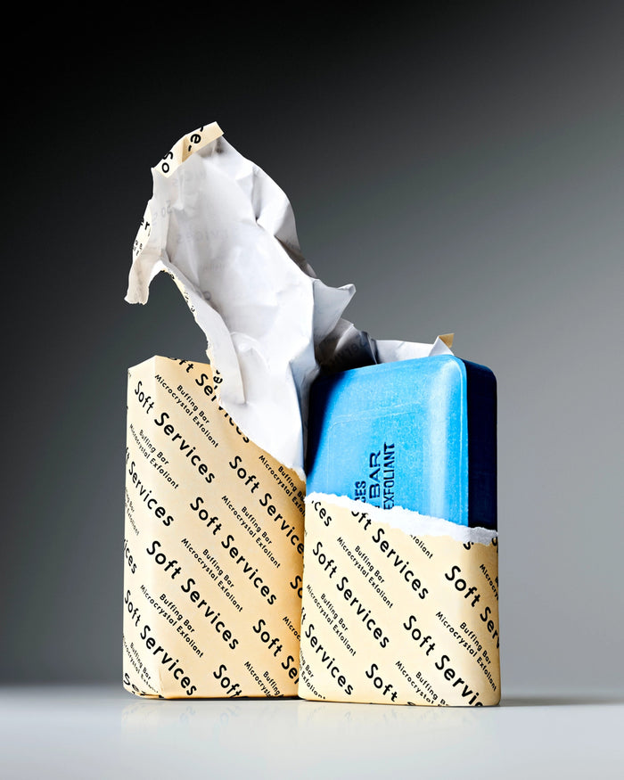
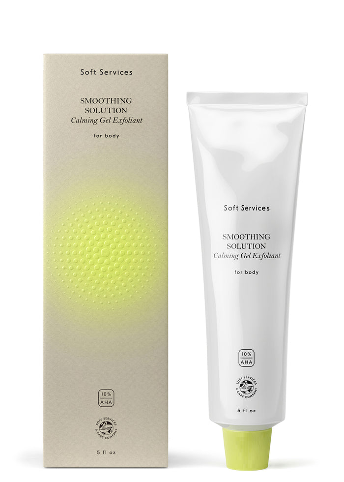
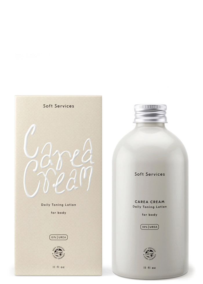
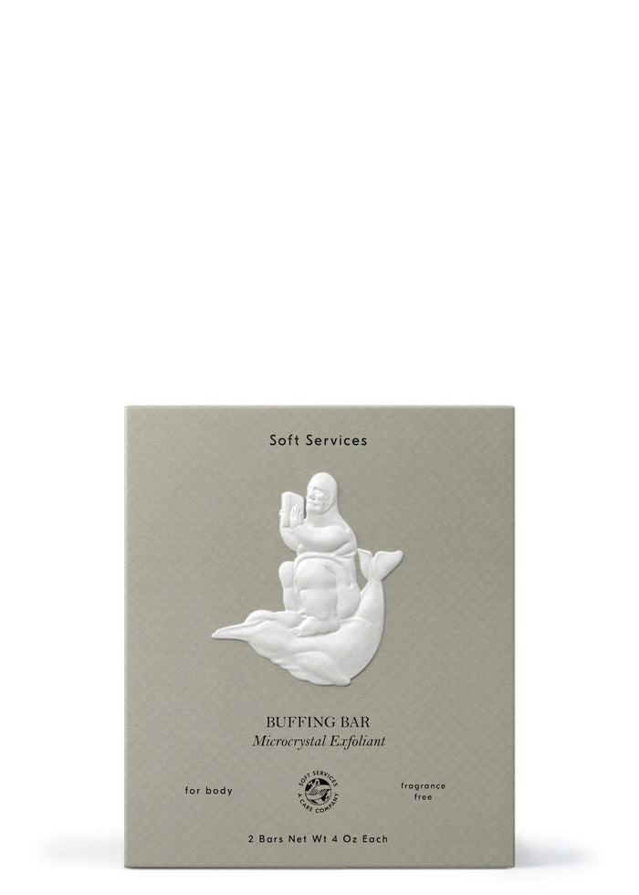
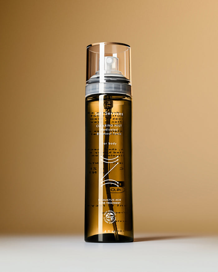
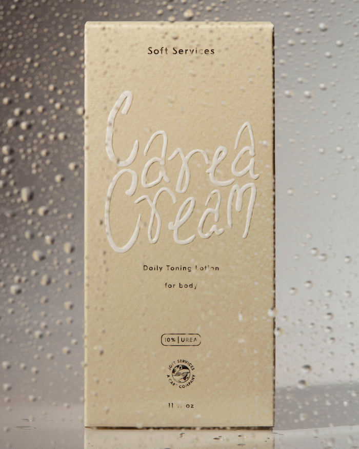
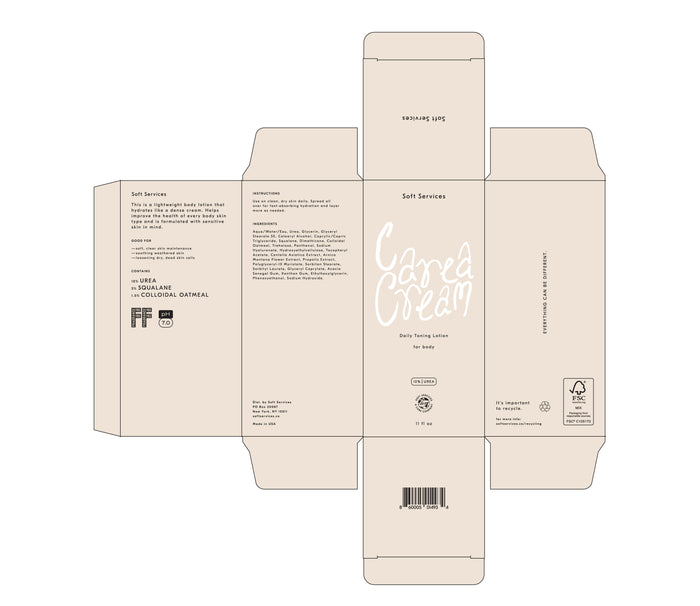
Sustainability is a core part of the packaging. Colors are varied between products and materials, so producers are never asked to color-match between components—a process that can lead to batches of components being thrown away if the color isn’t accurate. The inconsistency of post-consumer plastic is embraced, with the designs incorporating cloudy tones instead of asking producers for clear, virgin plastic. Cartons are uncoated so they are fully curbside recyclable.
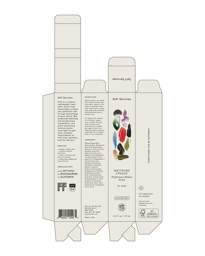
Brand Identity
Packaging Design
Packaging Guidelines
What we did
